
Visualization and exploration#
Start here when you want to understand the generated payment world before building a model or connecting a service. The notebooks use 1,000 deterministic payments and show temporal behavior, distributions, fraud populations, and point-in-time feature structure.
The core path uses the existing Polars and FraudTwin APIs. The third notebook
uses scikit-learn’s deterministic TSNE implementation for an exploratory
embedding; install the optional notebook packages in its clearly marked cell.
No package-level dependency is added.
Reference figures#
These compact figures are generated from bounded deterministic summaries. They illustrate expected shapes, not real-world fraud prevalence.
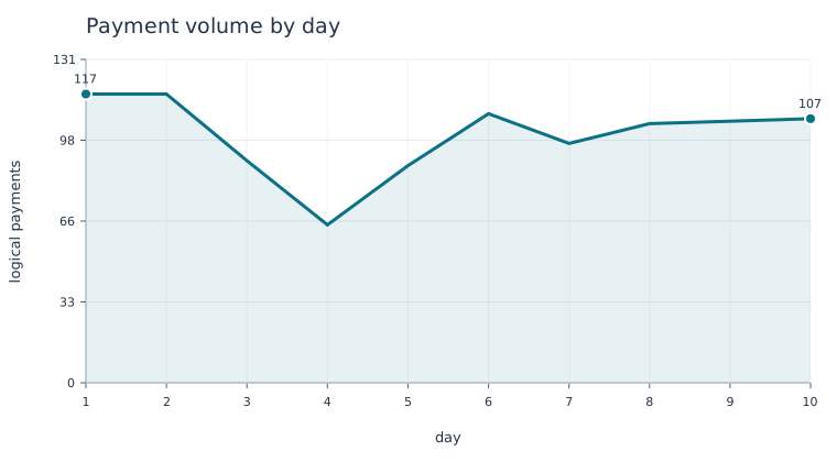
Figure: deterministic seed 42, bounded tutorial run; generated by
docs/scripts/generate_figures.py. Use the curve to inspect temporal shape,
not to infer real-world volume.
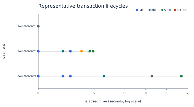
Figure: five representative payment lifecycles. Each row is one logical payment; markers show rail-specific initiation, authorization, capture, settlement, refunds, and rejects relative to initiation. This is a qualitative temporal view. The x-axis uses a log scale in seconds and is bounded at 120 seconds (two minutes), so early events do not collapse at zero. The wider left margin keeps payment IDs readable. It is not a service latency SLO; label maturity is shown separately.
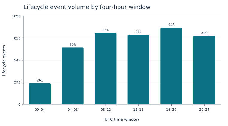
Figure: the quantity distribution of lifecycle events across UTC windows. The notebook computes the same aggregation from generated event timestamps.
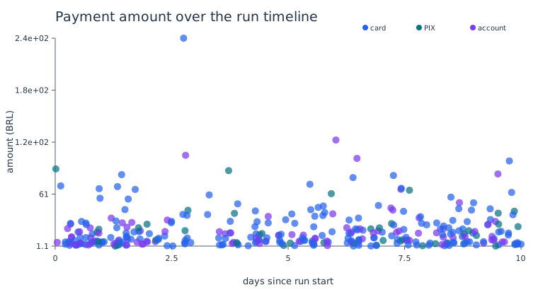
Figure: each point is a bounded generated payment sampled across the ten-day run; color separates payment rails. This exposes time clustering and amount outliers without pretending that the synthetic schedule is production traffic.
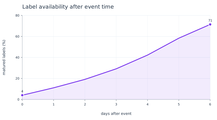
Figure: label availability delay from the same bounded synthetic workflow.
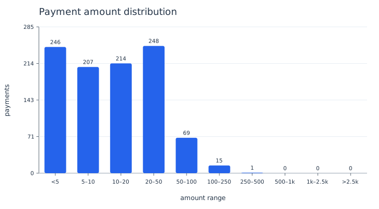
Figure: amount/frequency shape for exploratory analysis; source tutorial is the ML-ready distributions notebook. Bars are amount ranges, not individual transactions.
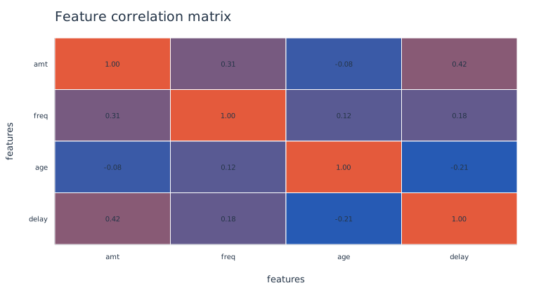
Figure: pairwise feature correlation is a leakage-screening aid, not evidence of causality. It uses the bounded seed-2501 analysis path.
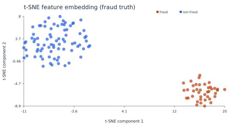
Figure: a deterministic t-SNE embedding coloured by fraud truth. The figure
generator and notebook use scikit-learn when the optional ml extra is
available; the base-only fallback uses the same feature matrix’s first two
dimensions. The axes are arbitrary embedding coordinates and should not be
compared across separate t-SNE fits. It contains 120 points.
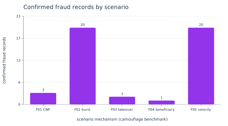
Figure: confirmed (fraud_truth=True) records by the stable F01–F05 scenario
mechanism IDs in the bounded camouflage benchmark. These are generated case
counts—not difficulty scores. Difficulty and camouflage are run-level controls,
so they must be read from the manifest and compared across separate runs; they
are not categories called “easy” or “hard” on each record.
Focus |
Time |
Extras |
Output |
|---|---|---|---|
Time, space, amounts, and lifecycle events |
20–30 min |
base; plotting optional |
timelines, time-window bars, tables, fingerprint |
Scenarios, difficulty, camouflage, and benchmarks |
20–30 min |
base |
comparison tables and manifest |
Distributions, correlation, leakage, PCA, and t-SNE |
25–40 min |
|
feature report, embeddings, split checks |
Tutorials#
Next path: Getting started.